4 October 2026 · 7 min read
ROC curve and AUC explained, and when to use PR AUC instead
The ROC curve and its AUC score tell you how well a classifier ranks positive examples above negative ones, without picking a threshold. This post explains how the curve is built, what an AUC of 0.5 or 0.9 means, why it can look good on rare-class data, and when to report PR AUC instead.
The ROC curve is a plot of how many real positives a classifier catches against how many negatives it wrongly flags, drawn across the full range of decision thresholds at once, and AUC is the area under that curve. It is used to judge a model that outputs a score, such as a spam probability, before anyone has decided where to cut that score into "spam" and "not spam". When the positive class is rare, for example 1% of the data, the same idea applied to precision and recall, called PR AUC, usually gives a more useful number.
What problem does the ROC curve solve?
Most classifiers output a score between 0 and 1, and a threshold turns it into a decision: score at or above 0.5 means positive, below means negative. Once the threshold is set, each example lands in one of four counts:
- TP (true positive): a positive the model flagged.
- FN (false negative): a positive the model missed.
- FP (false positive): a negative the model flagged by mistake.
- TN (true negative): a negative the model correctly left alone.
Laid out as a 2x2 table, these counts are the confusion matrix, which describes the model at one threshold. Move the threshold from 0.5 to 0.3 and more examples get flagged, so TP and FP both go up. The ROC curve removes that dependence by measuring the model across the full range of thresholds.
How the ROC curve is built
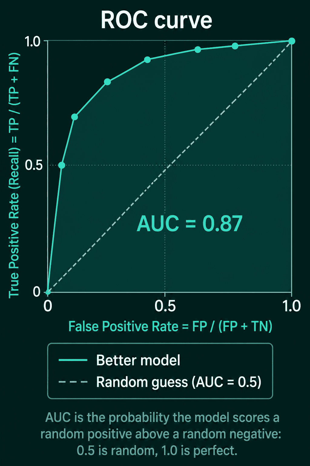
The curve has two axes. The true positive rate (TPR), also called recall, is the fraction of real positives the model catches:
$$\text{TPR} = \frac{TP}{TP + FN}$$
The false positive rate (FPR) is the fraction of real negatives the model wrongly flags:
$$\text{FPR} = \frac{FP}{FP + TN}$$
To draw the curve, sort the examples by score from highest to lowest and lower the threshold one example at a time. Each step adds one example to the flagged set, and you get one $(\text{FPR}, \text{TPR})$ point. A threshold above the top score flags nothing, which is the point $(0, 0)$. A threshold below the lowest score flags the whole dataset, which is $(1, 1)$. A model that scores at random traces the straight diagonal from $(0, 0)$ to $(1, 1)$, and a better model's curve bends up toward the top-left corner.
What AUC means
AUC (area under the curve) is the area under the ROC curve, a number between 0 and 1. Read directly, AUC is the probability that the model gives a higher score to a randomly chosen positive example than to a randomly chosen negative one. An AUC of 0.5 means the model ranks a random positive above a random negative half the time, which is what random scores do. An AUC of 1.0 means each positive is scored above each negative, so some threshold separates the two classes perfectly.
Why ROC AUC can look good on imbalanced data
Take a dataset with 100 positives and 9,900 negatives, so 1% of the examples are positive. At some threshold the model flags 990 examples: 90 true positives and 900 false positives.
- Recall is $90 / 100 = 0.90$.
- FPR is $900 / (900 + 9000) = 0.091$.
That ROC point sits near the top-left corner and looks strong. Now look at the flagged examples themselves. Precision is the fraction of flagged examples that are really positive:
$$\text{Precision} = \frac{TP}{TP + FP}$$
Here that is $90 / 990 = 0.091$, so nine in ten flagged cases are false alarms. FPR and precision both count the same 900 false positives, but FPR divides them by the 9,900 negatives, while precision divides them by the 990 flagged cases. With 99% negatives, the FPR denominator is so large that hundreds of false positives barely move it, so the ROC curve stays near the top-left while precision drops.
A model that labels each example negative is not the failure case here, since it sits at $(0, 0)$ on the random diagonal.
The precision-recall curve and PR AUC
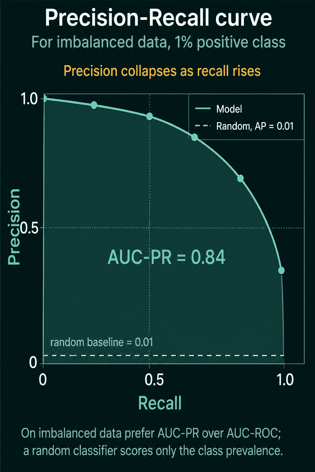
The precision-recall (PR) curve sweeps the same thresholds but plots precision on the vertical axis against recall on the horizontal axis. True negatives appear nowhere in either formula, so a pile of false positives shows up directly as lower precision. PR AUC is the area under that curve.
The usual way to compute PR AUC is average precision (AP). Walk down the sorted list, and at each threshold $n$ write $R_n$ for the recall and $P_n$ for the precision there. Then
$$AP = \sum_n (R_n - R_{n-1}) , P_n$$
In words: each time recall goes up, add the size of that step times the precision at that point. This step-wise sum is what is usually reported as PR AUC. Connecting PR points with straight lines and taking the trapezoid area instead tends to overstate the score.
The baselines differ from ROC. A random classifier gets a PR AUC equal to the fraction of positives in the data, so 0.01 on a 1% positive dataset and 0.5 on a balanced one. A perfect classifier gets 1.0.
Computing ROC AUC and PR AUC in PyTorch
The snippet below computes the ROC points, ROC AUC, and average precision in plain PyTorch, then runs them on two synthetic datasets. In both, positive scores come from the same distribution and negative scores come from another, so the model's ranking quality is identical. One dataset is balanced, and the other has 100 positives and 9,900 negatives.
1import torch
2
3def roc_points(scores, labels):
4    order = torch.argsort(scores, descending=True)     # highest score first
5    y = labels[order].float()
6    tp = torch.cumsum(y, 0)                            # positives above each threshold
7    fp = torch.cumsum(1 - y, 0)                        # negatives above each threshold
8    tpr = torch.cat([torch.zeros(1), tp / y.sum()])
9    fpr = torch.cat([torch.zeros(1), fp / (1 - y).sum()])
10    return fpr, tpr
11
12def roc_auc(scores, labels):
13    fpr, tpr = roc_points(scores, labels)
14    return torch.trapezoid(tpr, fpr).item()           # area under the curve
15
16def average_precision(scores, labels):
17    order = torch.argsort(scores, descending=True)
18    y = labels[order].float()
19    tp = torch.cumsum(y, 0)
20    precision = tp / torch.arange(1, len(y) + 1)
21    return (precision * y).sum().item() / y.sum().item()   # precision at each positive, averaged
22
23def make_data(n_pos, n_neg):
24    scores = torch.cat([torch.randn(n_pos) + 2.0, torch.randn(n_neg)])  # positives score higher on average
25    labels = torch.cat([torch.ones(n_pos), torch.zeros(n_neg)])
26    return scores, labels
27
28torch.manual_seed(0)
29for name, n_pos, n_neg in [("balanced", 5000, 5000), ("1% positive", 100, 9900)]:
30    s, y = make_data(n_pos, n_neg)
31    print(f"{name:12s} ROC AUC {roc_auc(s, y):.3f}  PR AUC {average_precision(s, y):.3f}  "
32          f"random PR AUC {n_pos / (n_pos + n_neg):.2f}")
33
34# AUC as a ranking probability, on the imbalanced set
35pairs = (s[y == 1][:, None] > s[y == 0][None, :]).float().mean()
36print(f"P(random positive scores above random negative) {pairs:.3f}")
37
38# one threshold: the score that catches 90 of the 100 positives
39t = s[y == 1].sort(descending=True).values[89]
40pred = s >= t
41tp, fp = (pred & (y == 1)).sum().item(), (pred & (y == 0)).sum().item()
42print(f"threshold {t:.2f}: TP {tp}, FP {fp}, recall {tp / 100:.2f}, "
43 f"FPR {fp / 9900:.3f}, precision {tp / (tp + fp):.3f}")1balanced ROC AUC 0.924 PR AUC 0.924 random PR AUC 0.50
21% positive ROC AUC 0.941 PR AUC 0.221 random PR AUC 0.01
3P(random positive scores above random negative) 0.941
4threshold 1.00: TP 90, FP 1589, recall 0.90, FPR 0.161, precision 0.054ROC AUC barely changes between the two datasets, 0.924 and 0.941, because the score distributions are the same and ROC AUC measures ranking. PR AUC drops from 0.924 to 0.221, because with 99 negatives per positive many more negatives outscore each positive. The pair count gives 0.941 again, which is the ranking reading of AUC checked directly. At the threshold that catches 90 of the 100 positives, the model flags 1,589 negatives, an FPR of 0.161 and a precision of 0.054, so about 19 in 20 flags are wrong.
The functions expect label 1 for the positive class and 0 for the negative class. In a real project, a tested library implementation of ROC AUC and average precision is the safer choice over hand-written versions like these.
When to use ROC AUC, when to use PR AUC
A workable rule of thumb: for balanced datasets, use ROC AUC, and for imbalanced datasets, use PR AUC.
A common mistake is reporting a high ROC AUC on data with a rare positive class and stopping there. On the 1% positive data above, ROC AUC is 0.941 while precision at 90% recall is 0.054, and PR AUC is the number that shows it. When reading a PR AUC, compare it to the positive rate, since that rate is the random baseline: 0.221 is far above the 0.01 baseline on 1% positive data, and the same 0.221 would be below the 0.5 baseline on balanced data.
Related concepts
Precision, recall, and the confusion matrix at a single threshold are covered in the precision, recall, and F1 post. How the evaluation data is split before any of these metrics are computed is covered in data leakage in machine learning and cross-validation explained.
QuiddityML teaches ROC AUC and PR AUC as two concepts in the ML Foundation track, with multiple-choice questions on what an AUC of 0.5 means and why ROC AUC stays high on 1% positive data, and a step-by-step exercise that works out recall, precision, and FPR for a model with 90 true positives and 900 false positives.